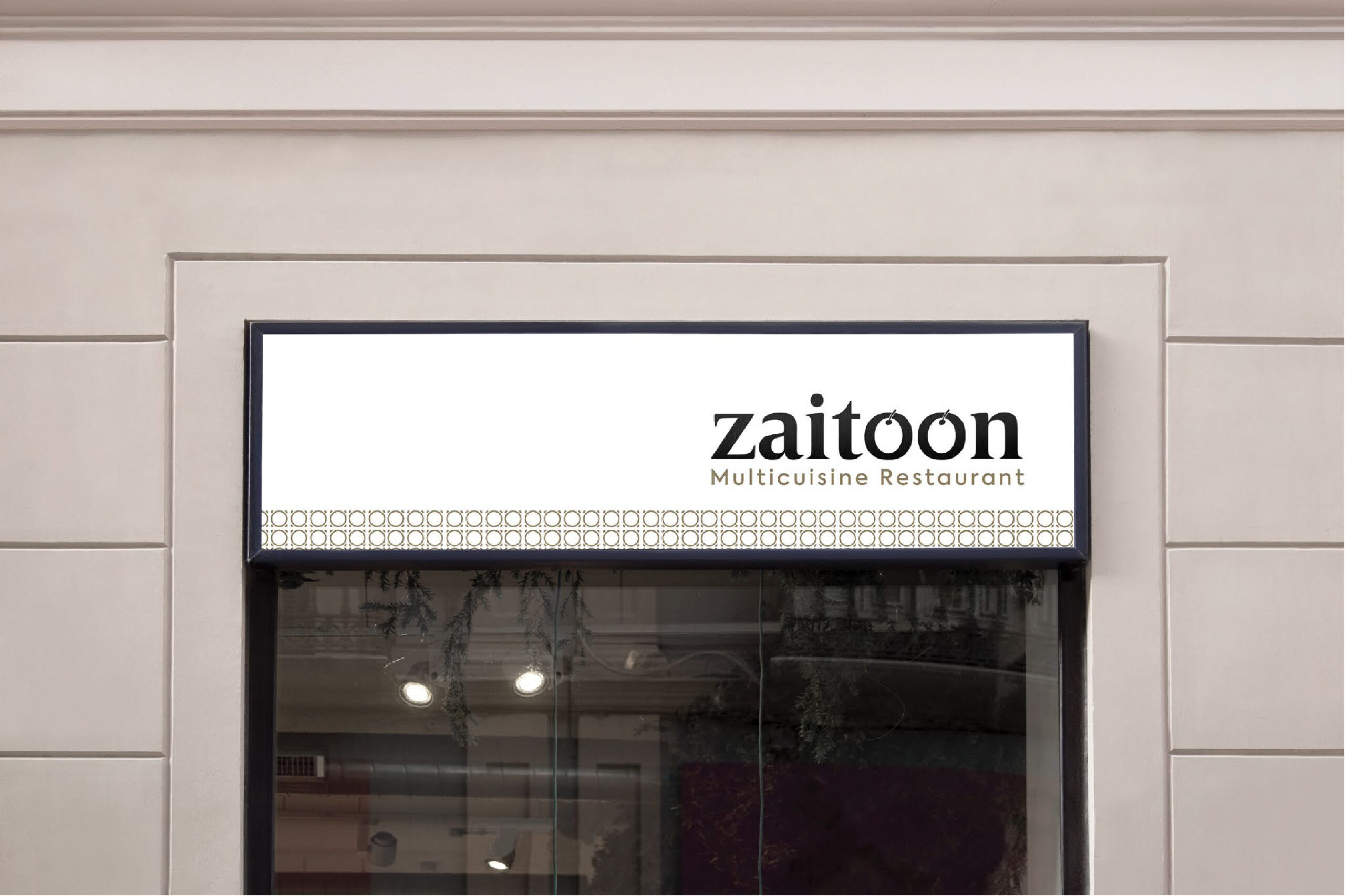
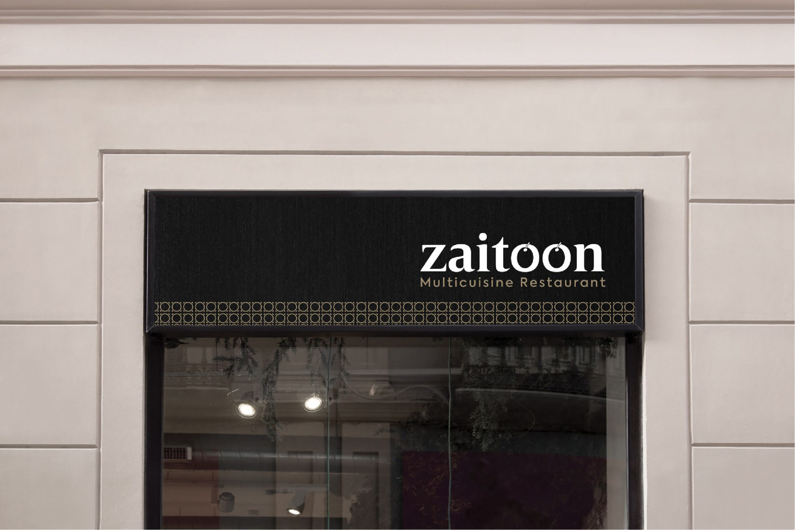
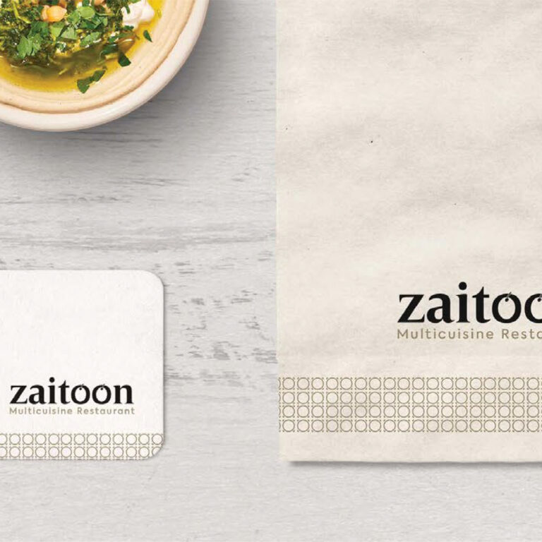
Logo Story
We started out working with the original logo, and developed it based on the idea of the word “Zaitoon” conveying it through the text itself.
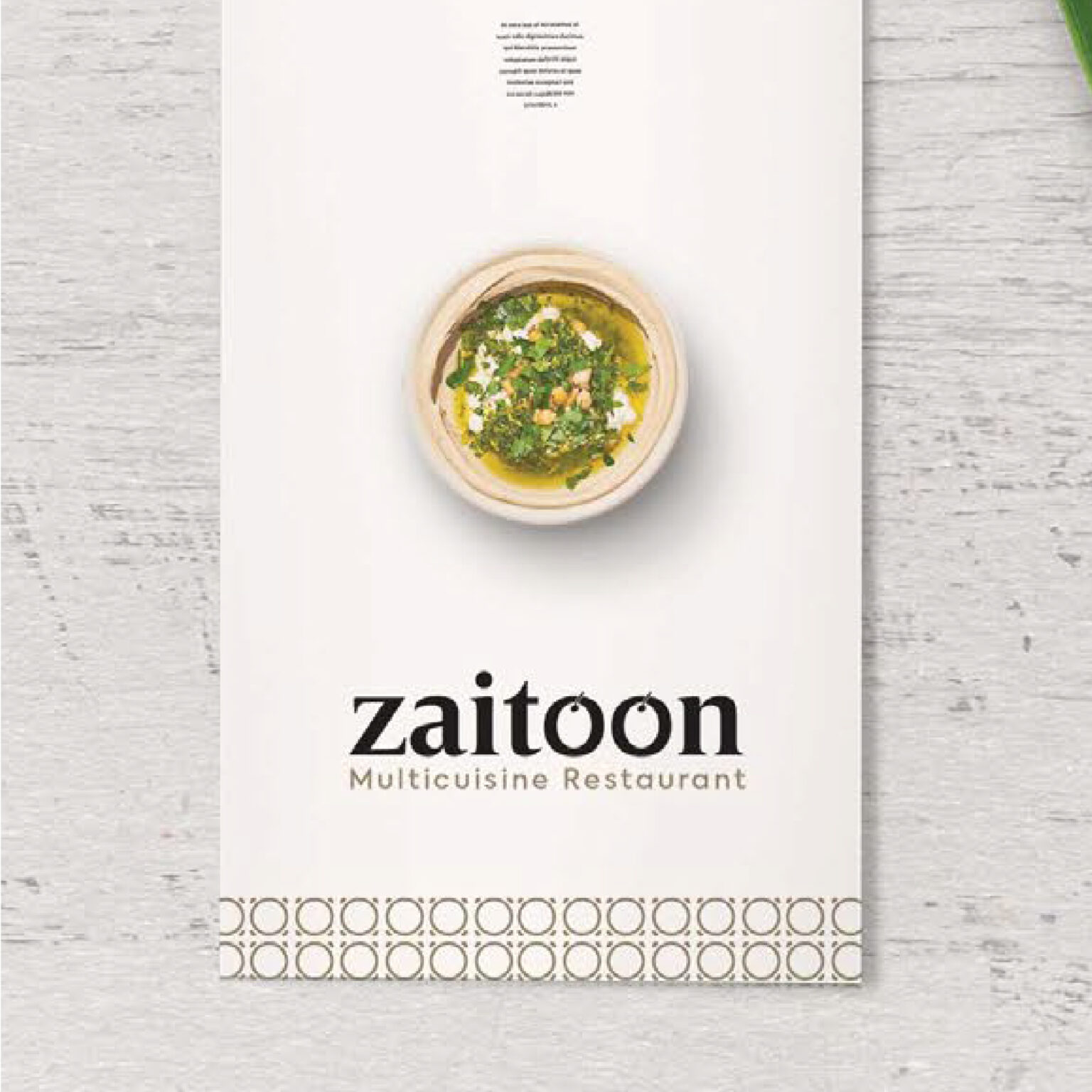
Zaitoon provides best delicacy that carries along a cuisine of finely cooked tasty temptations.
We started out working with the original logo, and developed it based on the idea of the word “Zaitoon” conveying it through the text itself.
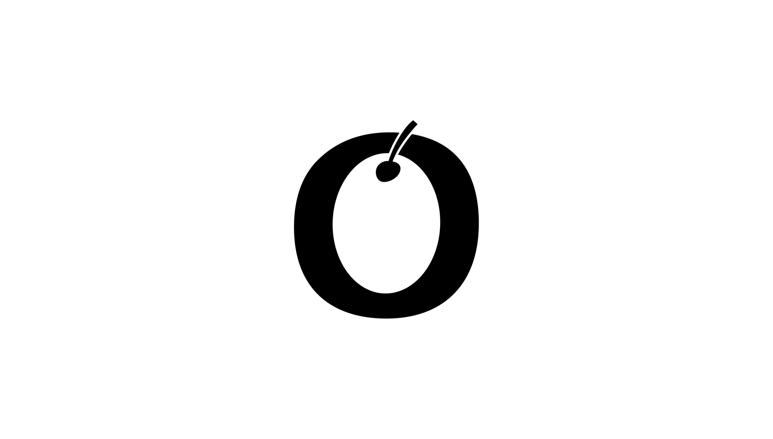
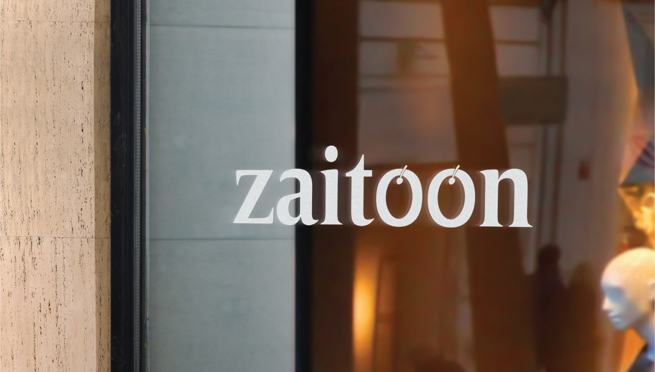
The logo needed to be smooth, and readable, so the use of very contemporary visual language and fresh typography and fonts were appropriate.Thus, the usually sharp Serif font is smoothened . But then the idea of substituting an even fresher concept and incorporating it into the logo emerged.
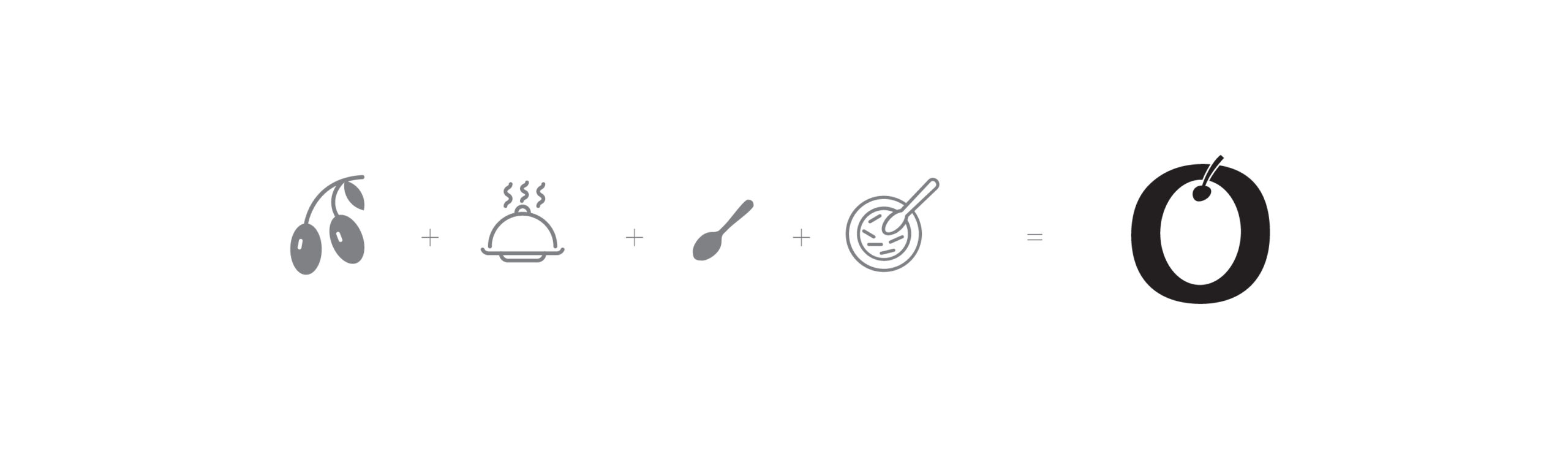
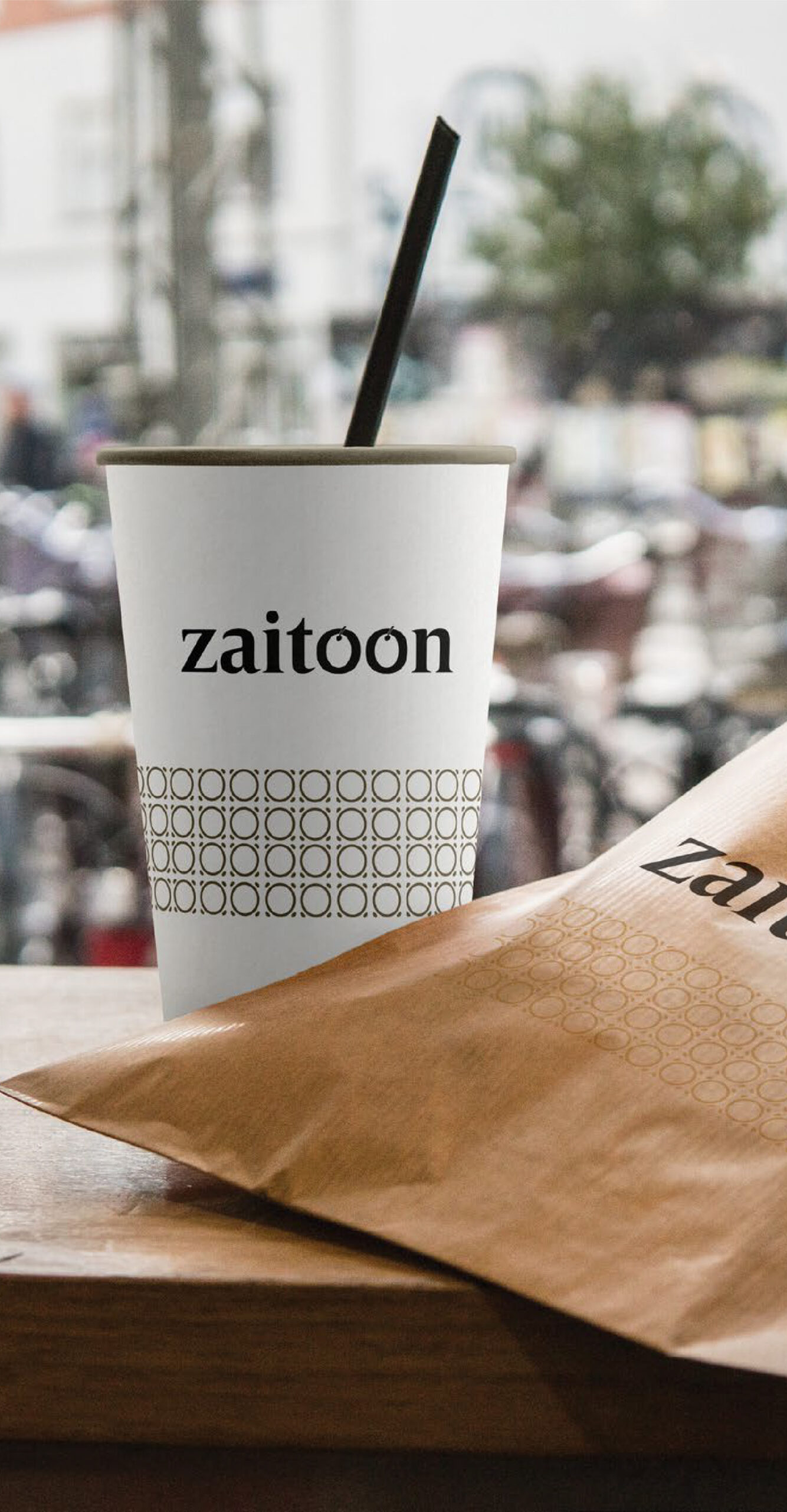
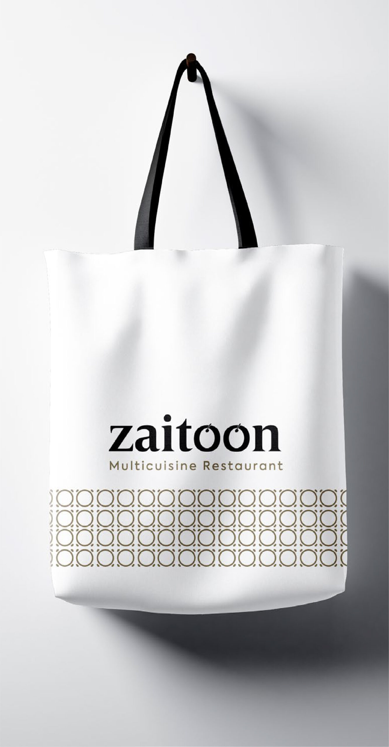
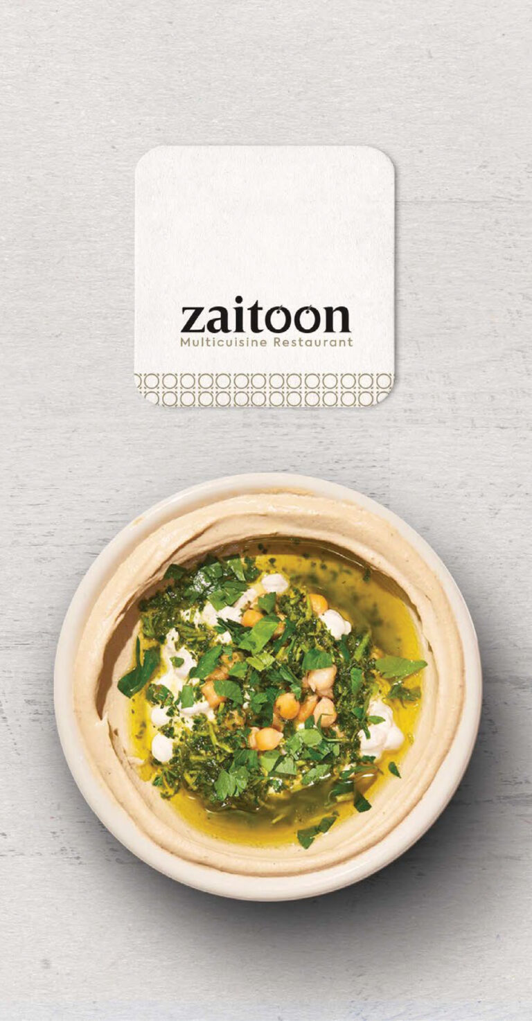

The O in “Zaitoon” stands out for its meaning Olive. The global icon for food, spoon and fork, represents the universality of the concept. The imagery of the food lid spreads out the message of safe and hygenic dining experience. And voila! it all came together.