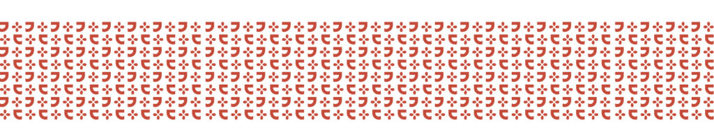
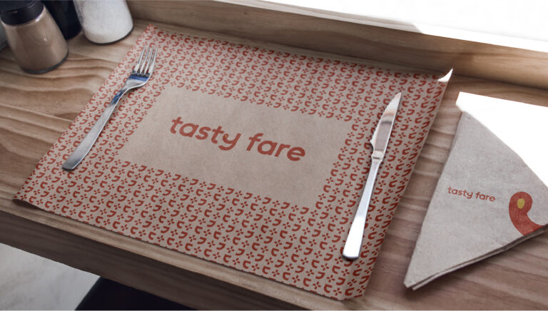
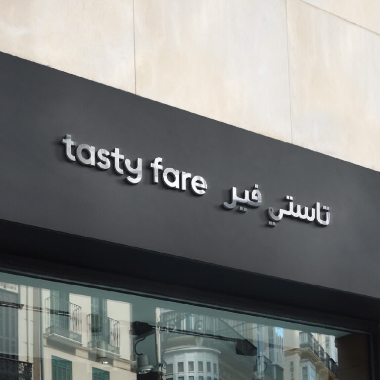
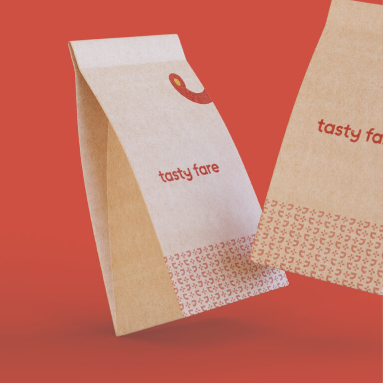
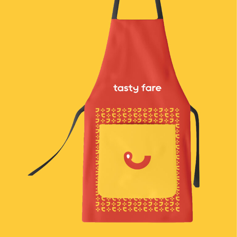
Logo Story
Being the dream-project of a group of vivacious and spirited businessmen, designing a unique brand identity for Tasty Fare was challenging and fascinating. A unique identity that is bold, modern and minimal was the proposed concept and our team has worked it out well after long researches and persistent efforts.
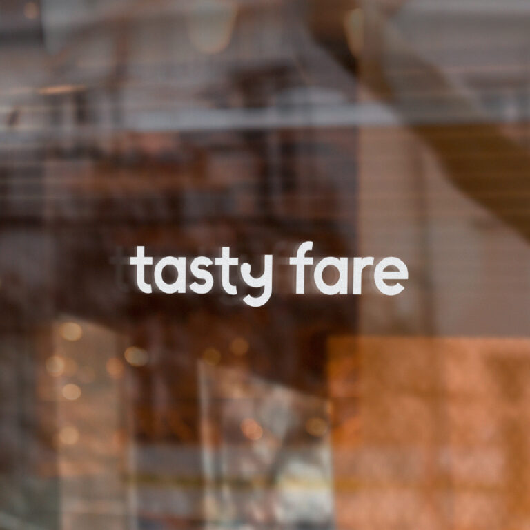
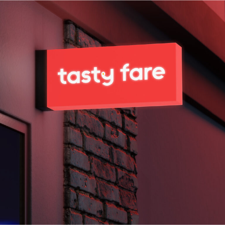
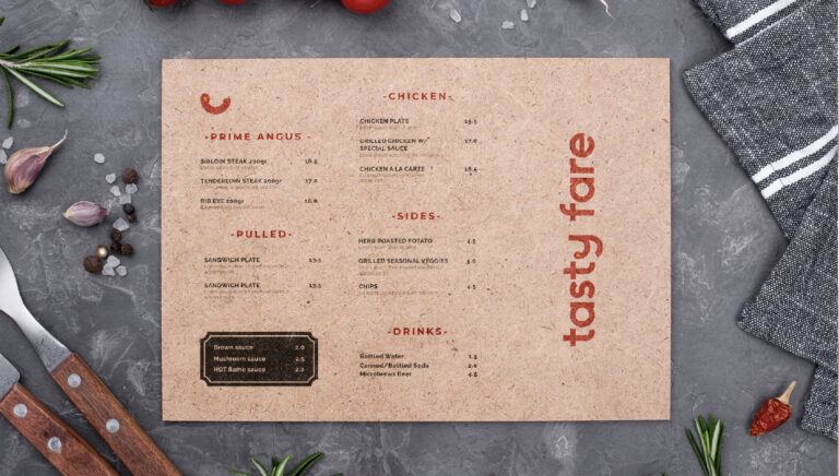
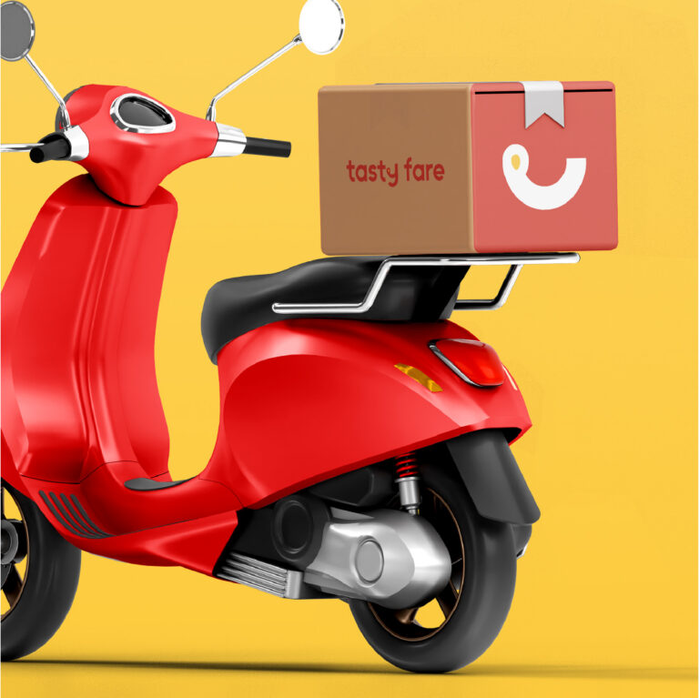
The typography ‘tasty fare’ is easily readable and effortlessly recallable. The bold look and the accurate edges of the letters simply replicate the nature of the brand. The brand icon emblazoned in y- yummy face emoji- epitomizes the mouth-watering dishes served over here. The letter y has also been designed with an impression of a cup that is the universal symbol of food and beverages. Once the identity is applied, it can surely steal the attention of the customers as the colours used are very catchy and striking.
Typography
A functional, constructive sans-serif with universal, geometric forms. Dedicated to the life and work of Bauhaus pioneer Josef Albers, the typeface follows a disciplined approach to composition using a limited palette of modular blocks.