Logo Story
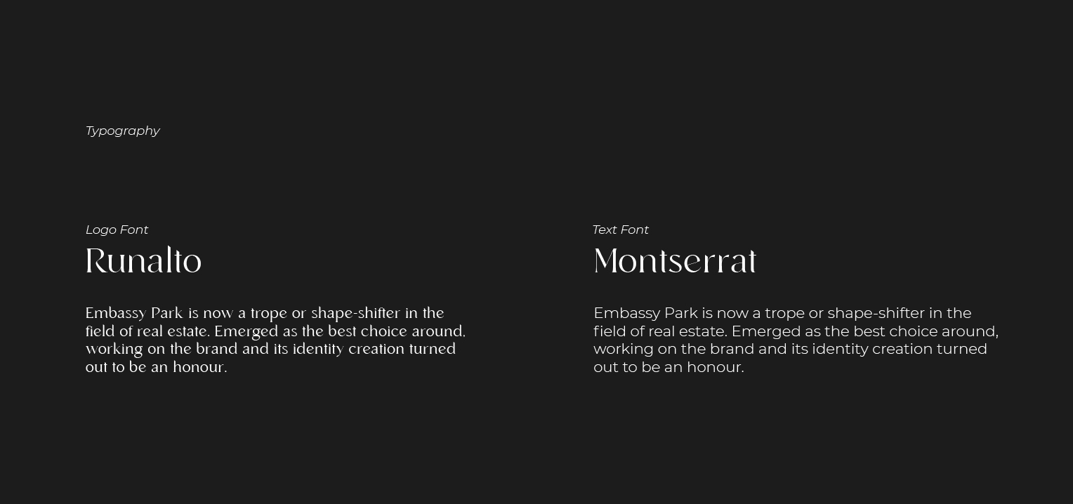
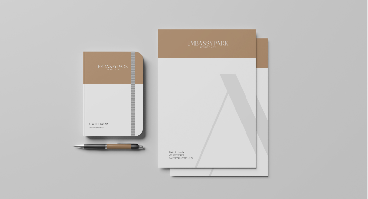
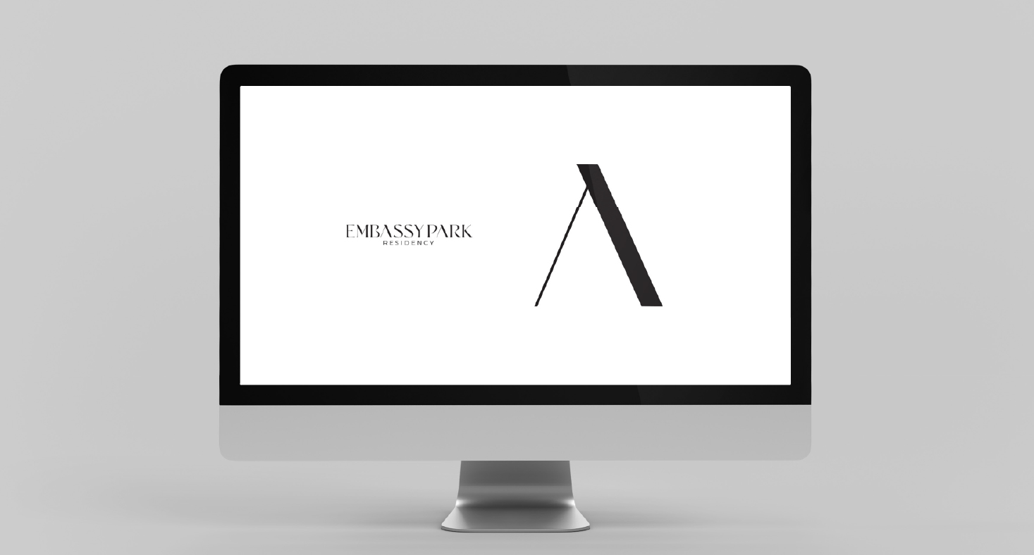
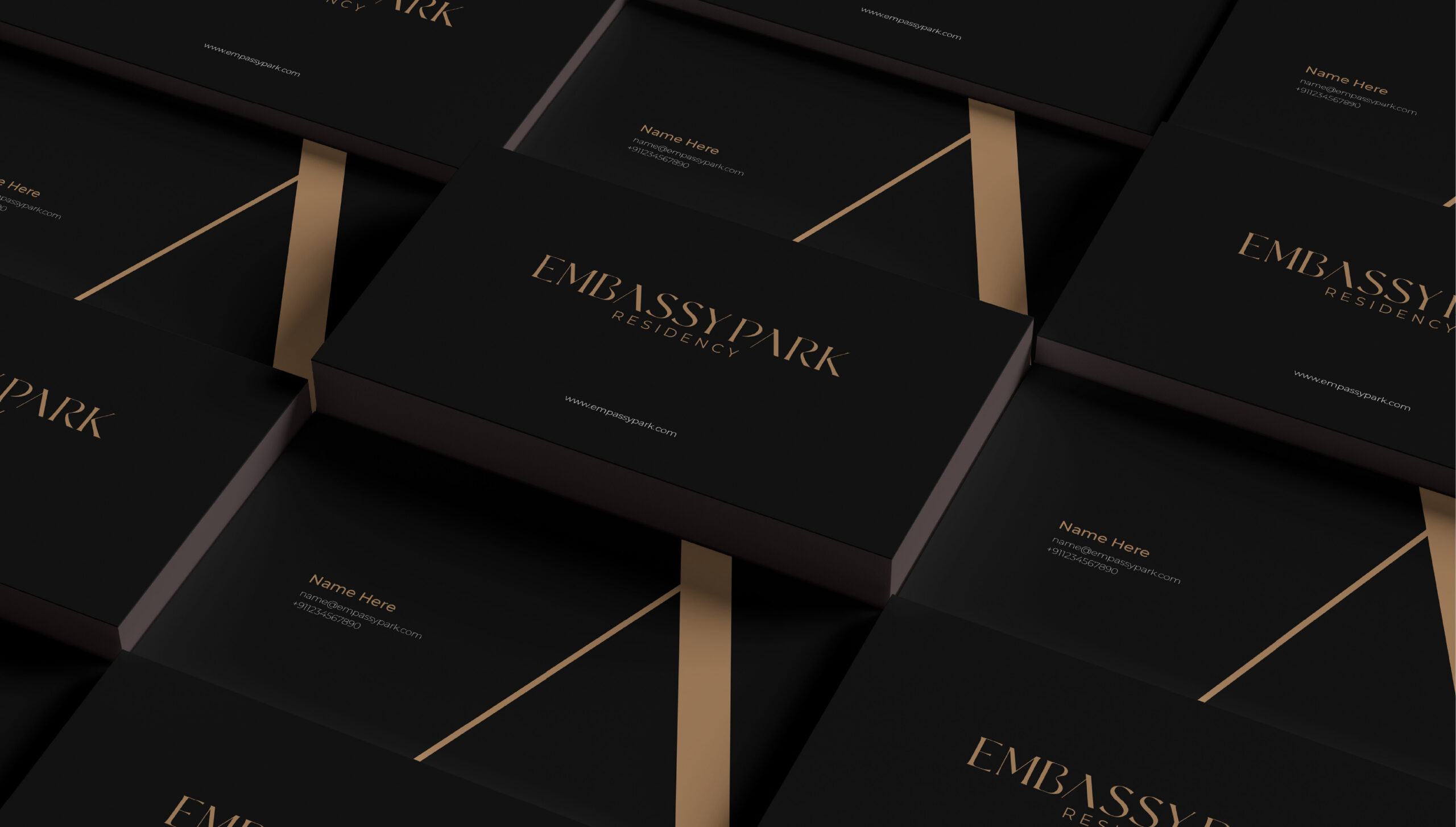
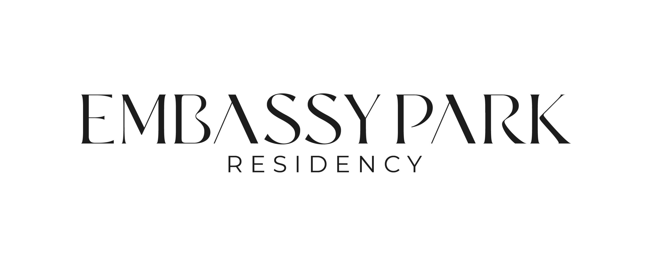
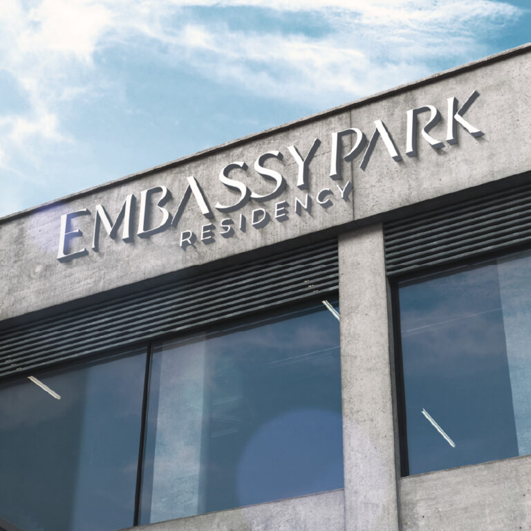
The typography EMBASSY PARK is easily-readable and effortlessly-recallable. The curvaceous nature of the typography and the unique but classic appearance of it double the charm of it.
Embassy Park is now a trope or shape-shifter in the field of real estate
The typography EMBASSY PARK is easily-readable and effortlessly-recallable. The curvaceous nature of the typography and the unique but classic appearance of it double the charm of it.
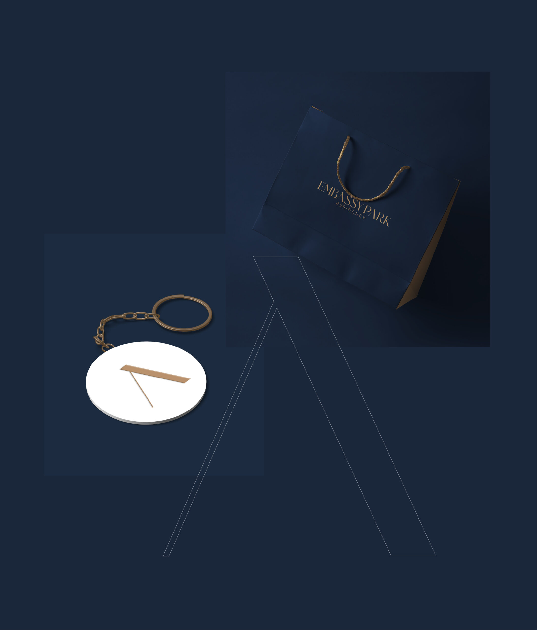
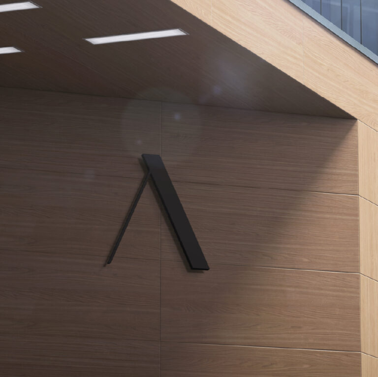
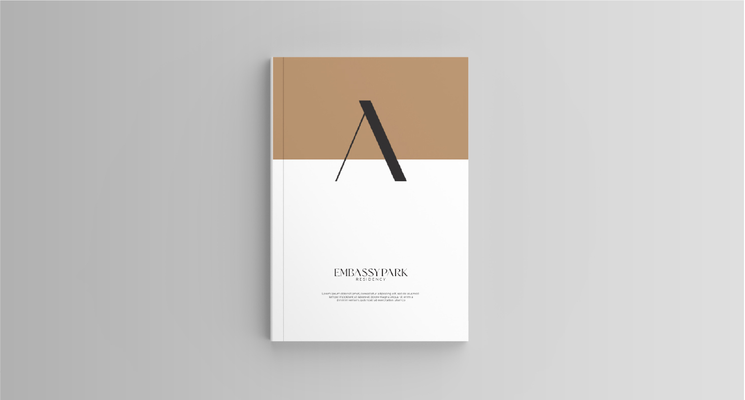
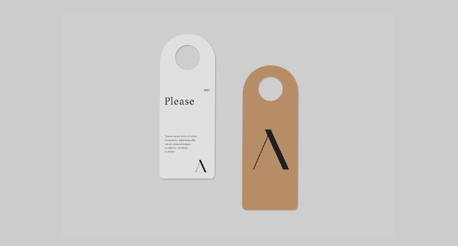
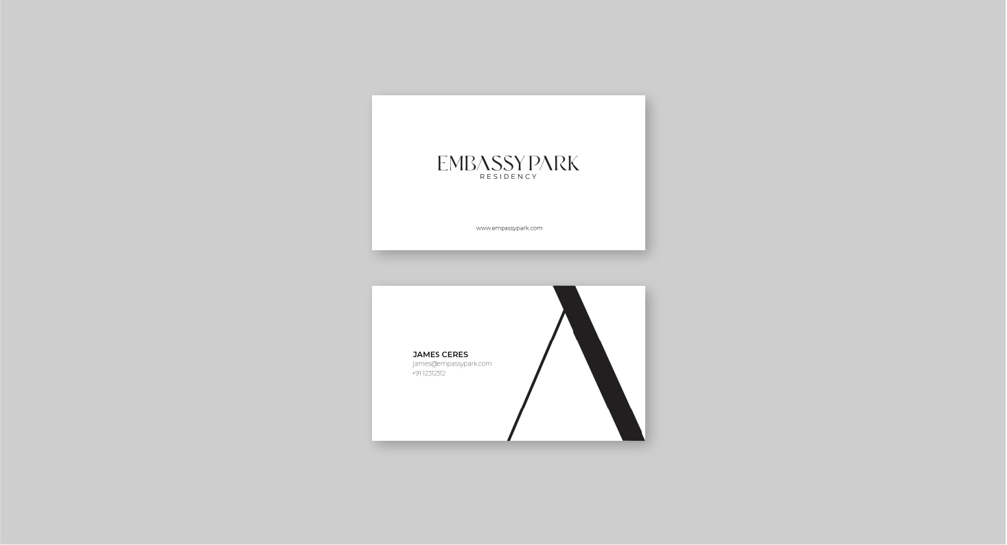
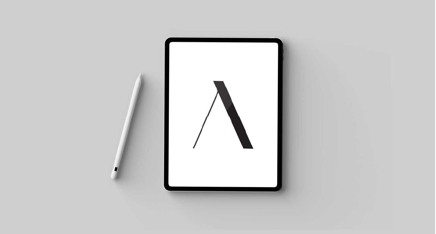
The letter A used as icon of the EMBASSY PARK represents the class quality the Residency holds in the industry. The embodiment of roof inscribed in it indicates the roof of security EMBASSY PARK offers and the roof of dreams EMBASSY PARK craves for.

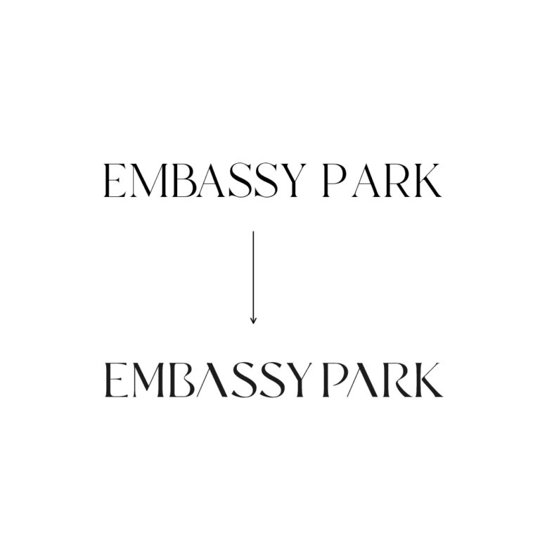

The curvaceous nature of the typography and the unique but classic appearance of it double the charm of it
The font used here is Serif, that’s often used to illustrate establishment, tradition and age, making it a great choice for corporate brands. The history of Serif can be traced back to the Roman Empire where it was carved into stone structures like Trajan’s Column.
