Logo Story
Grihaar is a young and dynamic brand of hygiene and health care products. Creating a unique brand identity as lively as Grihaar was quiet challenging yet interesting.
Grihaar is a young and dynamic brand of hygiene and health care products. Creating a unique brand identity as lively as Grihaar was quiet challenging yet interesting.
Grihaar is a young and dynamic brand of hygiene and health care products. Creating a unique brand identity as lively as Grihaar was quiet challenging yet interesting.
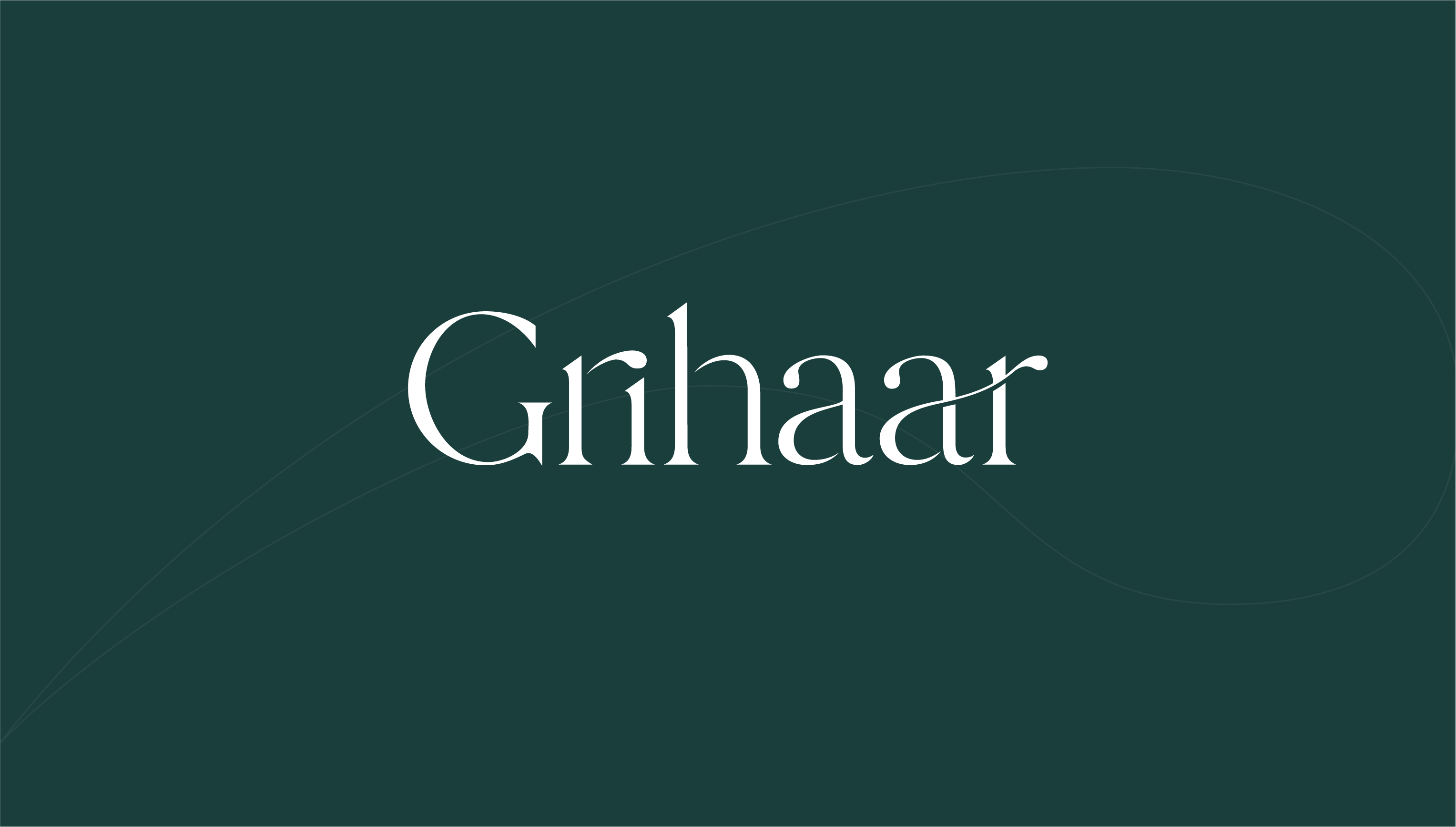
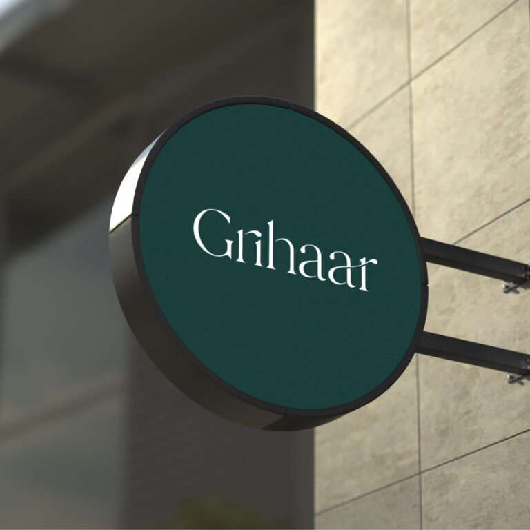
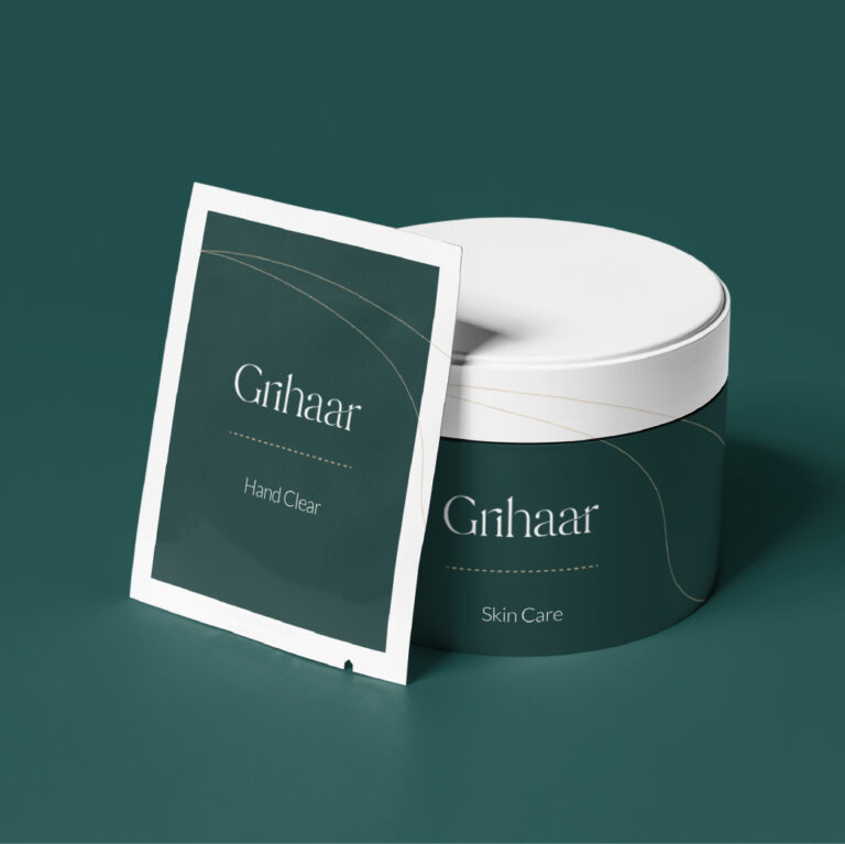
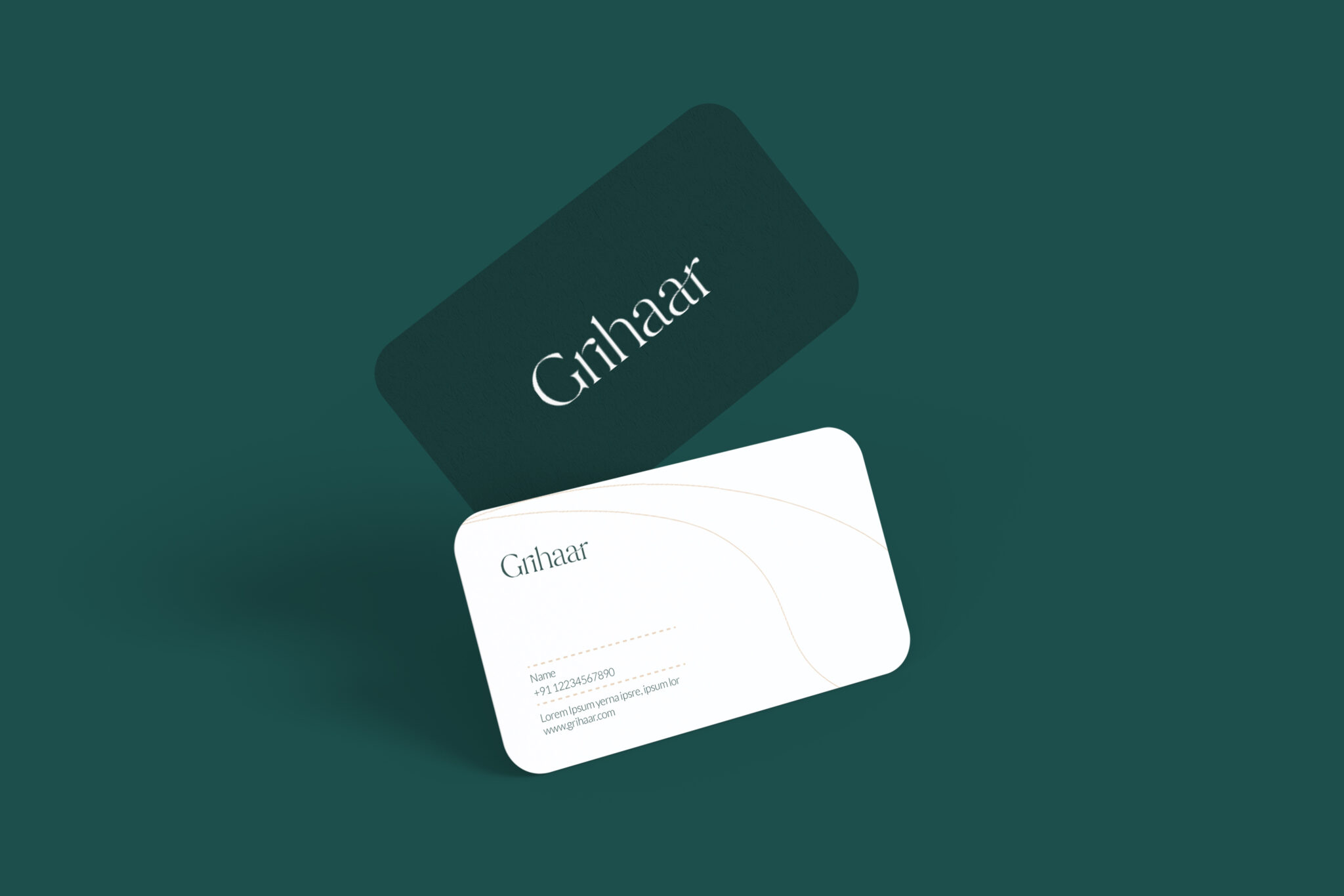
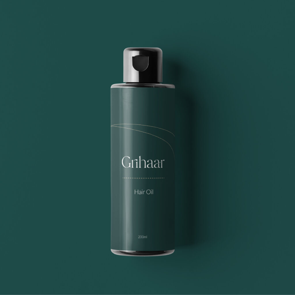
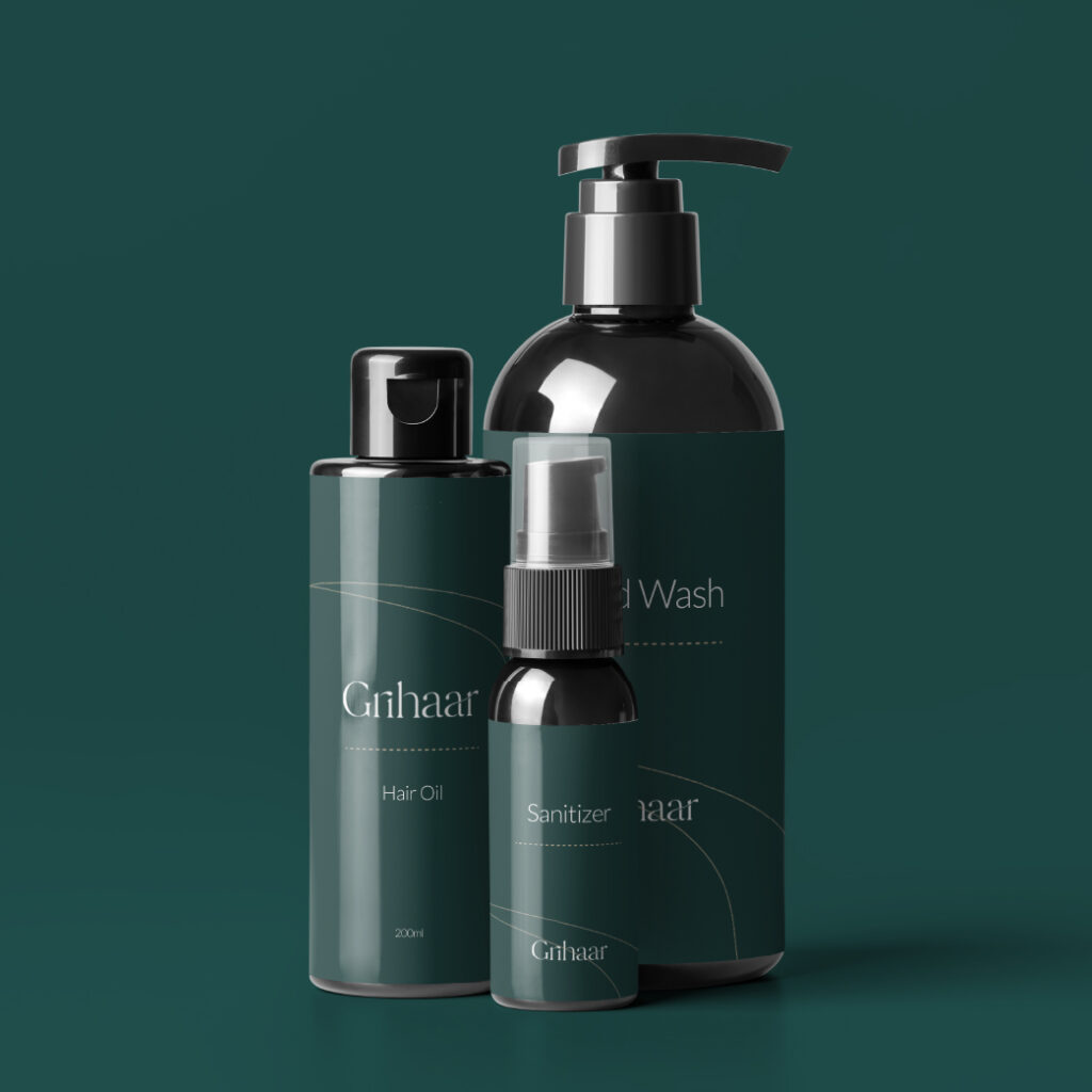
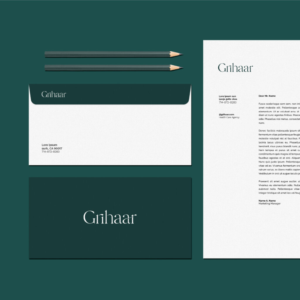
The very Sans Serif font used in the typography is a brand statement, i.e., we are clean and approachable. The clean lines and precise ends are what make the font more visible and very readable. The elegant, classy look of the typography shows the premium quality of the brand.
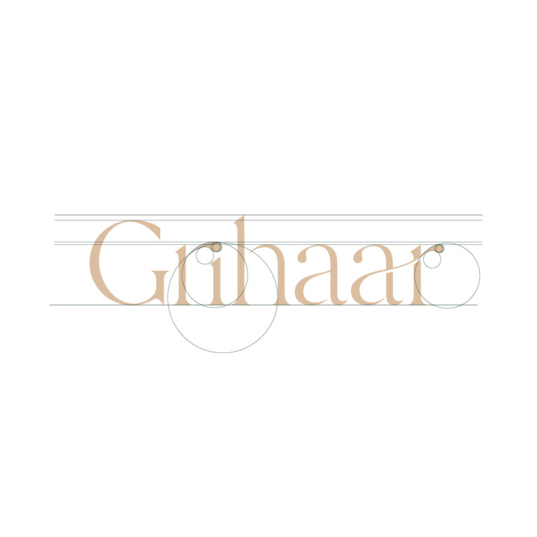
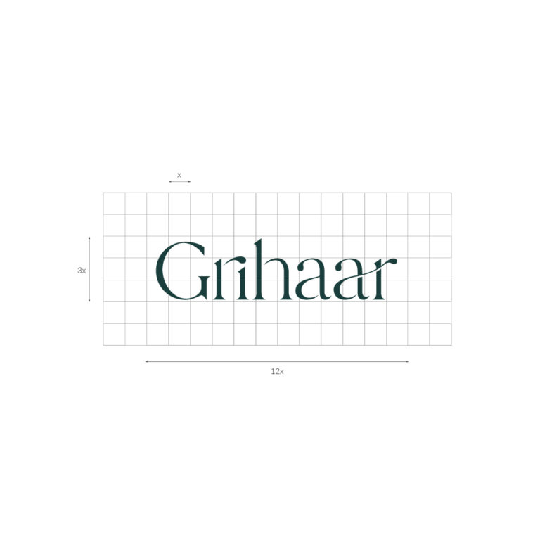
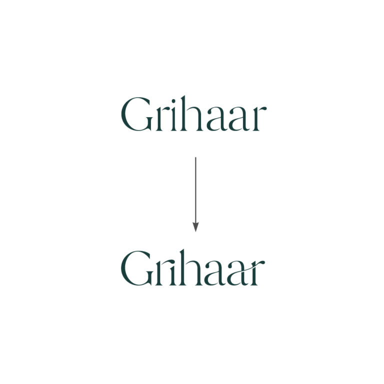
The edges of the letters ‘r’ and ‘a’ customised/ designed as to look like a drop, the minimal representation of the brand’s product that are fluid in form, or a dew that characterizes the freshness and youthfulness.
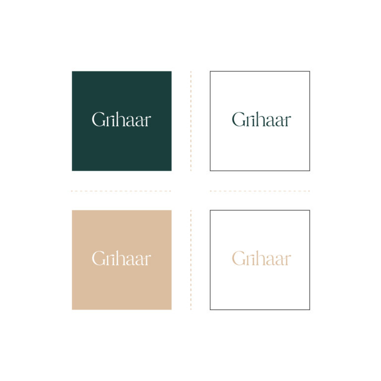
The colour green used in the identity signifies wealth, stability, renewal, and nature. It also evokes a feeling of plentitude and is associated with peace, rest and security. The colour white epitomizes cleanliness, innocence and purity. The combination of these two colours make it natural, and simple.
